Monday 24 March 2014

ANOTHER NEW PAGE and ANOTHER REDONE PAGE...

Another long ass day. I decided I fucking hate the Taker bird thing with the long neck. It was ruining my composition for the new page for hours. I'm still not completely content with it, but I think on paper it would look better. The redone version of the clothes Taker looks a bit better too.


Sunday 23 March 2014

Working out my process...

Today I've been exploring the process of illustration that I've been using for my kids book, and ultimately seem to be using more and more. So below are two images I created in order to test and refine that method, and I'm happy to say that I've got it alllll sussed out! Also, I'm considering doing a zine for advice from mice and maybe submitting that for my final major project too. It would certainly be awesome to have at our London show because it conveys the more comical and strange side of my work. I've also included the 12 images that I created the other day, which were quite popular with people, in order to show what might be expected from the zine.


 Below are some screenshots of my website progress too. I've started adding images to my illustration section. I want it to have at least 12 good images by the end. My about me section is done and I've added an animation section which has an embedded link to my animation 'Glass Half Empty'. So that's going quite well! Once I've got the whole thing built I'll pay for the domain and upgrade so that I can take the moonfruit branding out of my url and the website itself.


Thursday 20 March 2014

Progress...

It's nice when after days of struggling you nail an image on the first time. Hopefully I can knock off the next two pages today too and I'm back on schedule!

Here's what I've got for the next pages. I debated using the speech bubble but I'll have to see what my tutors think. For now I think it's the best way to convey what's happening on that page, since it switches who's talking mid sentence. Also I'm debating hand written text vs font. The font helps it fit into the written element more, which is my main concern with having the speech bubble. I want it to be read with the normal text, not as an after thought.


Tuesday 18 March 2014

Revisiting pages...

So yesterday felt like a total waste of time. I wasn't happy with anything I made and I still have issues with the Taker who wears clothes. Just before bed I tried to use a different design for her but it that was shit too (see below)


So I wasn't happy with that, and I wasn't happy with the image of all the Takers together either. But first things first, I had to redesign the other Taker. I've ended up with this page now and I'm pretty happy. Next I'll be redoing the above page with my new character design and then I'll probably redo the page with all four Takers.

Changed the mouth shape. I think the above one is a little too cartoony and breaks the style of the book. I've also enhanced the colour of the Taker to make it a little brighter. I've done the following page too.


Monday 17 March 2014

New page and POKEMON!!

I've gone and done me another page. I'm sort of losing the order now because when I struggle with a page I skip to a page that I can do more easily, which is what I've done here. Also POKEMON! Thought I'd drop that in here because I think I want it to go on my website to convey my new way of working and the funnier side of things that I do. Also this may be useful if I'm going to do a mini graphic novel style inkling for the PP.


Oh and I got around to editing an earlier page to have the yellow Taker getting stuck in a jumper.


Friday 14 March 2014

Building a website...

I've dedicated my Friday morning to working on my website. I'm pretty pleased with how it's going. I wanted the red lines to appear as a mouse rollover but I just couldn't get it to work. However, they do linger on the title for the correct page which is pretty cool. It's actually pretty fun building a site when you can add your own images as link buttons and stuff! I'll be spending the afternoon working on my book again but next stop will be creating an image gallery on the site. I've started saving images at the same size in preparation. I don't have an awful lot to show right now because it's only been these last couple months that I've settled into a way of working that  I'm happy with and want to showcase on my site. Here's a screen shot of how it's looking right now.

I've done another double page and also altered the colour of the Taker's legs from the page prior to this one. Now I can either push forward or go back and edit my clothes Taker page. Originally I'd given this Taker some Dexter's lab references like glasses and orange hair/leaves but the glasses weren't working and I wanted to change the colour. I've kept the lab coat though!


Thursday 13 March 2014

I've broken my rule...

As stated above, I've broken my rule! I've decided that SOME pages can be full bleed colour, such as this. I think it helps create more variety in the book which is very important. Also, I definitely want to redo the earlier one with the Taker who wears skins. Also I added colour to earlier pages too, which I will show here. Also here's a wip of my newest page, since I rarely post the wips these days.


Wednesday 12 March 2014

Pages 15 and 16...

Ok here's the next one done! The previous page I might make the Taker a little more animated by having him actually putting clothes on. I think that would make for a better page.


Tuesday 11 March 2014

New page...

I might take the sting out of some of those purples on the clothes rack. Then again I might not. We'll see!
(I did do that)


Monday 10 March 2014

Hey I got that page sorted!

As much as I didn't want to create full colour spot illustrations, I felt like the image on the left was worth it. Plus it helps to prevent all the pages from being too predictable to have something like this

And then I removed some of the clutter like the extra tree and the small picture of the Taker. Originally he was in it because he wasn't going to be on this page at all, but since that changed it seemed logical to create a bit more space.

Thursday 6 March 2014

Professional Practice unit...

I thought I'd better write this down, lest I forget about it. I've been looking at the submissions for the PP unit and it struck me - I should make mine into an illustrated narrative. This can be displayed in an informal picture book style, which makes perfect sense since I'm interested in picture books, writing and narrative. I'm actually really excited about doing it and making it funny! Lots of self portraits and embarrassing anecdotes. I don't want to be too ambitious with it though, for fear that I run out of time to create my kids book too.

Redoing that big birdy page thing..

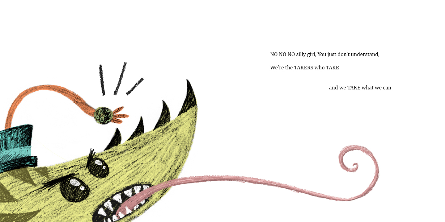
This is better. More texture, less blurriness, more contrast. Bit too big though. And I'm not sold on the neck.

This size is a little more preferable but I think I should redo the neck to make it have a more natural appearance rather than this straight up rigid thing.

Hmm. Not so sure about the white eye any more. It might be something that I should limit to the little girl Taker. Also, the head looks too separate from the neck.
There we go! Now I feel much better. I made the transition from neck to head look more natural and took the eye back to this creatures original design. This is the one :)

Tuesday 4 March 2014

Twitter promo...

I think I can get away with posting this here because it can count to the 'professional practice' aspect of our unit. Also I LOVE the contrast of sketchy ass cartoons against nice clean fonts! I can imagine my business cards being something like this.


New page/s...

I've shown this image in my crit before but I've applied to the full page spread dimensions now which is cooooool. Originally I experimented with having the words sort of trail off on to different lines for 'take what we can' but it kinda looked sloppy so I've kept it like this for now. Also I know that it's not very normal to have your main image sitting intentionally on the crease of the page but I think because it's a face on, large view of the creature it works. We get all the info we need, nothing is slipping into the crease. Back to storyboarding and stuff now!

I think I may redraw the neck of the bird taker to be a bit more interesting or just to move in a continuous flow rather than the up then down thing I've got going on for this one.

Saturday 1 March 2014

Edited page and a new one! Hooray!

I'm getting the hang of this shit now. It's all about a nice balanced, spacious composition and little interesting elements and characters. Or something. Also you may notice that I've sorted out the Takers face on my big landscapey page to resemble his earlier incarnations. This stuff always looks kinda sucky on screen, but image it in context, nice white matte paper, crease down the middle. I can't wait to have it in print :)


Oh and I've added this little dotted line now to show the flight path of the insect in pages 3 and 4.