Friday 28 February 2014

More story editing...


Today I started storyboarding, but it didn't last for long. I was suddenly like FUCK! I don't even know how much space I'm gonna need and uhrgsjkfheskfihehf. So basically I got my old script-a-roony out and crossed out some of the lines I won't be using and re-designated page space for individual segments. NOW I can go back to storyboarding. Also, I'm gonna try hard to make each new turn of the page contrast against the last. So when I've had a page with a landscape double spread thingy I will probably go to something close up for the next etc. You get me. Also I was able to cut out about 6 more lines today. This segment for example:

The great beast that was chomping on flesh and on bone
and the woman who used creatures skins as her own
The man who kept creatures in cages for zoos
and the science-y man began wondering too

We're the takers who take but we've taken too much
With our self centred ways we've begun to lose touch


ALL OF THAT *POP* gone! I don't need to reiterate what the takers do. The page prior to this will mention that they are rethinking their position and the following images will show that, so I don't need to describe it. NEVER SAY WHAT YOU CAN SHOW. Or something. The next two lines are too similar to my end lines too, and since the takers aren't necessarily all going to be together I find the concept a little bit weird that they'd all say the EXACT same thing at the same time. So yeah, cut that out. This puts my word count at 515 which is way below the maximum for the age range I've chosen, which actually means (in theory) that the age rang could spread wider than my original intentions. Maybe. I can imagine my tutors disagreeing but we'll see.

Thursday 27 February 2014

Creatures!

So here are a couple of creatures that actually get referenced in my story; an elephant-mouse and a scorpion bee. I was actually going to dive right into doing a page of these guys but decided to hold fire and consider starting a storyboard for my book. Also, I think I'd like this image to be a close up, with the trunk falling off the page and coming back up on the other page with the scorpion bee. I think that would work quite nicely. So this ended up just being a concept image for now. I like it though.


Monday 24 February 2014

Long ass day...

I was supposed to be doing interviews today... AGAIN. But yeah, I don't know what happened but apparently it's happening tomorrow now. So I ended up wasting the morning at uni talking about pokemon so I've only just stopped working since around lunch time. Still, after lots of scanning and colouring and positioning and sketching and hfsndfkndsuifhriufhwejf here's another image I've put together in preparation for my crit on Wednesnday. If I've got time I'll do the same image in a different style to contrast against this one in my crit and see which works better.

Ok so I put in a couple of extra hours and made a clean digital flat coloured version of this image. However, I've removed the image from this post because it is entirely pointless to show in my crit since it doesn't work on any level and I don't want to waste time discussing why. I'll put it back on afterwards.


Sunday 23 February 2014

ANOTHER RE-WRITE...

Some days I just can't seem to draw. But that's ok, because it gives me the chance to tweak my story. I've taken (hurrr hurrr, my book's called the takers) yet more lines from it, leaving me with a word count of 572. This will make my pages look a lot better. Also, I've completely changed some elements. Hopefully my drawing super powers will return after dinner because I really need to crack on. Also, as summarised in my facebook post...

"I just changed every 'It's not right' line in my vegan kiddies book to 'there's no need'. I think this subtle change highlights the difference between preaching and educating. 

The former phrase tells the individual (or monster) that what they're doing is wrong, and will likely make them become immediately defensive, and therefore unreceptive to any information you put to them. The latter phrase comes across like you're sharing a wonderful revelation. There's no *need*. Did you know there's no *need*? We don't *need* to do this! ISN'T THAT GREAT!? WE CAN LIVE WITHOUT CAUSING HARM! HOORAY!"
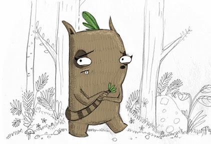
The Takers

In a world much like ours, only hidden from view,
Live the creatures that we call the takers, who knew?
The takers take creatures  to use as they please
From the elephant-mice to the scorpion-bees.
A young taker was saddened by such selfish deeds,
So she asked adult takers just what was the need.

She approached a great beast that was chomping away,
And she said just what she’d always wanted to say.
“Excuse me?” Said the girl, “All this food here is fresh.”
“There’s no need to take creatures to chomp on their flesh.”
“No no no!” He replied “You just don’t understand,”
“We’re the takers who take, and we take what we can.”

The next taker took creatures that used to be free
And he kept them in cages for takers to see.
“Excuse me…” Said the girl, “All these creatures seem blue.”
“There’s no need to keep creatures locked up in a zoo.”
“No no no” He replied, “You just don’t understand”
“We’re the takers who take, and we take what we can.”

Next she spoke to a taker, who used creatures’ skins,
As clothing and shoes and all kinds of strange things.
“Excuse me?” Said the girl, standing on tippy-toes,
“There’s no need to use creatures to make things like clothes.”
“No no no!” She replied “You just don’t understand”
“We’re the takers who take and we take what we can”

The next taker she saw had a science-y mind,
He did tests on small creatures to help his own kind.
“Excuse me?” Said the girl, “It’s so easy to see”
“There’s no need to hurt others to help you and me.”
 “No no no!” He replied “You just don’t understand”
“We’re the takers who take and we take what we can”

So she made her way home, feeling angry and glum,
She stormed into her house and she said to her mum.
“I can’t see how it’s right; I can’t see how it’s fair.”
“There’s no need to use creatures at all!” She declared.
“No no no.” Her mum said “You just don’t understand.”
“We’re the takers who…” “STOP!” Came the young girl’s demand.

“I have spoken to others who say just the same,”
So she sat with her mum and she tried to explain.

Meanwhile other takers were thinking things through,
Was their taking of creatures the right thing to do?
The great beast that was chomping on flesh and on bones,
And the woman who used creature’s skins as her own.
The man who kept creatures in cages for zoos,
And the science-y man began wondering too.

“We’re the takers who take, but we’ve taken too much”
“With our self-centred ways we’ve begun to lose touch.”

Knock, knock, knock came the sound on the young takers door,
It surprised her to see the takers from before.
“Little girl you were right, now we all understand.”
“It’s not right to use creatures just ‘cause we all can.”
“They have rights of their own and deserve to be free.”
“Not one creature exists just to serve you and me.”

So the girl and the takers decided that day,
To stand up for all creatures in every way.
They’d adopt homeless creatures and live cruelty-free,
And they’d educate others, just like you and me.
When they’d talk to new takers they’d start with the phrase,

“We were takers who took, but now things have to change.”

Saturday 22 February 2014

Details etc

I added a few trees and also tweaked the little girl character a little bit for this image. Then I did a close up of one of the takers (in theory) as a test for a potential page.


Wednesday 19 February 2014

Full page exploration...

I think I've got my method sorted now. I've got a crit in a week so I'll keep pumping out this stuff and see what they say. I'm going to explore adding more background and foreground elements in this image too because this minimal approach may yet be improved. Colour wise, not keen on the purple little girl but I like the bird taker. Also, when it comes to finalising pages I must remember to incorporate the animal exploitation into the scenes with the takers. So for instance, this one will be the one who eats animals, so there may be skulls or some other signifier around. Perhaps have the taker sat at a dinner table or something too. Whatever works best. Gotta keep stuff simple though.

I turned this image into an icy mountain scene for this test, as well as changing our protagonists colour to a reddy tone:


Monday 17 February 2014

no no no...

I'm sort of into this. I think with a nice, limited colour palette this style could work. I suppose I had still better consider background elements and do a few testers but, as mentioned in a previous post, I really like white space and the focus on the characters.


The one below is a little different. It's been worked on a little more than the others and I included outlines. I think I prefer the above images though, without lines unless necessary to describe form. Also I've decided that the characters need to be incredibly different from each other, except perhaps for the leaves on the head to show their relationship to each other as takers. So next I'm going to draw an entire scene and see how that goes.


Saturday 15 February 2014

Better?

I'm not sure but I feel like this is a lot more along the right lines than anything before. I think I could sketch and then use a lightbox to shade with my graphite stick and then scan in. Right?


Judging a book by it's cover...

I've done this before loads of times but I needed to do it again desperately. I sat in the children's book section at AUB (because it feels kinda creepy to sit in the one at the public library) and looked through all of the books. Then I selected my favourites. Then I selected my favourite pages from those favourites. Now I'm going to discuss what I like about these and what I would like to incorporate into my own book.


The first thing I notice of the pages that I like is the spacing. There is so much space (except for Salvatores but ignore that for now)! I love it. It draws attention to the characters which are the main focus of the story. I love white space too. Simple backgrounds work nicely too but I love the crisp, clean look of characters against white. I think it's something that works amazingly well in contemporary kids books, and can work very well for me since my story is ALL about characters and interactions.

Second, texture. All of these images are rife with traditional media textures. Now, I'm not willing to use a lot of traditional media, such as watercolours, for fear that they aren't suitable for vegans (as watercolour paper often isn't either). However, I can certainly imitate these textures to a degree using digital techniques.

Third, super stylised. The characters don't necessarily resemble their source material in a realistic way (like, erm, dragons?) but that's ok, you still know what they are. There's something about these quirky little shapes that work wonderfully with rough, sketchy drawings.

Fourth, limited colour palettes. In the images in which colour is more prevalent, it is often toned down and desatured to a pastel hue, probably as a result of the medium used. In either case, most people say that lots of colour is important to children's books, but I don't think it's anywhere near as important as carefully selected colour palettes like these.

Fifth, hand drawn text. Now I know that isn't in all of these images, and I know that the macmillan brief says to only use black text on white background, so I'm not sure I could even use hand drawn text anyway, but it really gives so much life to children's books. I suspect the older the reader, the less important a crisp, clear font is (maybe!).

So these are the five elements I want to incorporate into my children's book:


Space
Texture
Stylised drawing
Limited colour palletes
Hand drawn text.


Now that I've written it down I'm hoping it will sink in and inform/inspire me to create better work because I've really been stagnating recently.

Friday 14 February 2014

I really need another tutorial...

I'm burning out on this because I'm worried that I'm not making any progress and I'm not sure what to do about it. I'm not particularly comfortable working in this scan and colour way and I just want to scream.


Wednesday 12 February 2014

Leafy characters...


So these are some textured leafy characters. Obviously I still like my original design for the main character but it certainly does work when it's leafy. It might be worth making some parts of the takers more leafy and having exposed parts like the faces. You know, like in that old kids program the herb garden? "I'm a very friendly lion named Parsley..." right? RIGHT!?
Oh also, new character design for the protagonist. Prefer this little lady, she's at least 50 times more awesome.


Sunday 9 February 2014

Background element testing...

I decided to go all out and fill an A3 page with foliage. I think this sort of stuff might look good on the inside pages of finished books and at the same time it was good practice at drawing quickly. I need to apply more thought into putting my characters into context and this is basically my starting point. As you can see below, once I coloured it (which took ages by the way) I was able to change the hue however I wanted, which is a really useful facility that I make use of frequently.


Oh and this is just a really quick sketch I coloured in. It's horrible.


Webcomics...

Now, if I'm going to be cheeky enough to include this piece in my final major project then I suppose I'd better have a good reason. It just so happens that I do. Basically, I was thinking of starting a webcomic and popping that on to my learning agreement. It took me about a day to get this page written, drawn and coloured so I think you could get quite a lot done by the end of the project. Still, this isn't related to my kids book so I feel a little cheeky.


Tuesday 4 February 2014

New characters...

So I'm thinking this could be one of the new characters. I've also left the background blank just to see how the minimalist look works. Hmmm. I don't know.


Sunday 2 February 2014

Background testing...

I've still gotta run my design by my tutors but I thought I'd experiment with some character in context images in the meantime. I think that the characters would look quite nice against a majority white background so I've drawn some light digital lines to contrast against the rough pencil lines to see how that works. I do really like the idea of the characters being the only elements that possess colour but it might not make for a very pretty book. I don't know, I'll think about it. Also if this works as a style then it would also be worth trying the background elements as scanned, uncoloured pencil lines too. Also line thickness is another thing to test if we're exploring the uncoloured line backgrounds. Aside from that I could try having lineless shapes as background elements etc. Also if everything but the characters are colourless in the world it makes me wonder how they would interact with objects. So if my protagonist picks up a stick or something, would the stick remain white? Is the idea to make it sort of feel like a paper world?

The image above is the smooth digital lines.


This image is scanned pencil lines.


I actually really like how a background colour makes the white trees and background elements stand out. I think this might work rather well with fewer background elements though.


I probably won't use speech bubbles although they do have a certain charm.

Saturday 1 February 2014

Characters should have character...

This drawing is perhaps a little more cartoony than previous incarnations of her, but I like it. I would hate for my characters to be rigid, I want their personalities to shine through. So anyway, I hope this goes over well with my tutors because I really like it. I suppose this is the greatest balance I've found between drawing how I want and drawing in a way that is appropriate.