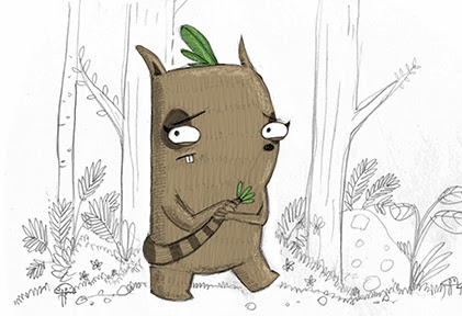
I've still gotta run my design by my tutors but I thought I'd experiment with some character in context images in the meantime. I think that the characters would look quite nice against a majority white background so I've drawn some light digital lines to contrast against the rough pencil lines to see how that works. I do really like the idea of the characters being the only elements that possess colour but it might not make for a very pretty book. I don't know, I'll think about it. Also if this works as a style then it would also be worth trying the background elements as scanned, uncoloured pencil lines too. Also line thickness is another thing to test if we're exploring the uncoloured line backgrounds. Aside from that I could try having lineless shapes as background elements etc. Also if everything but the characters are colourless in the world it makes me wonder how they would interact with objects. So if my protagonist picks up a stick or something, would the stick remain white? Is the idea to make it sort of feel like a paper world?

The image above is the smooth digital lines.
This image is scanned pencil lines.
I actually really like how a background colour makes the white trees and background elements stand out. I think this might work rather well with fewer background elements though.
I probably won't use speech bubbles although they do have a certain charm.


No comments:
Post a Comment