Sunday, 12 January 2014

Warming up...

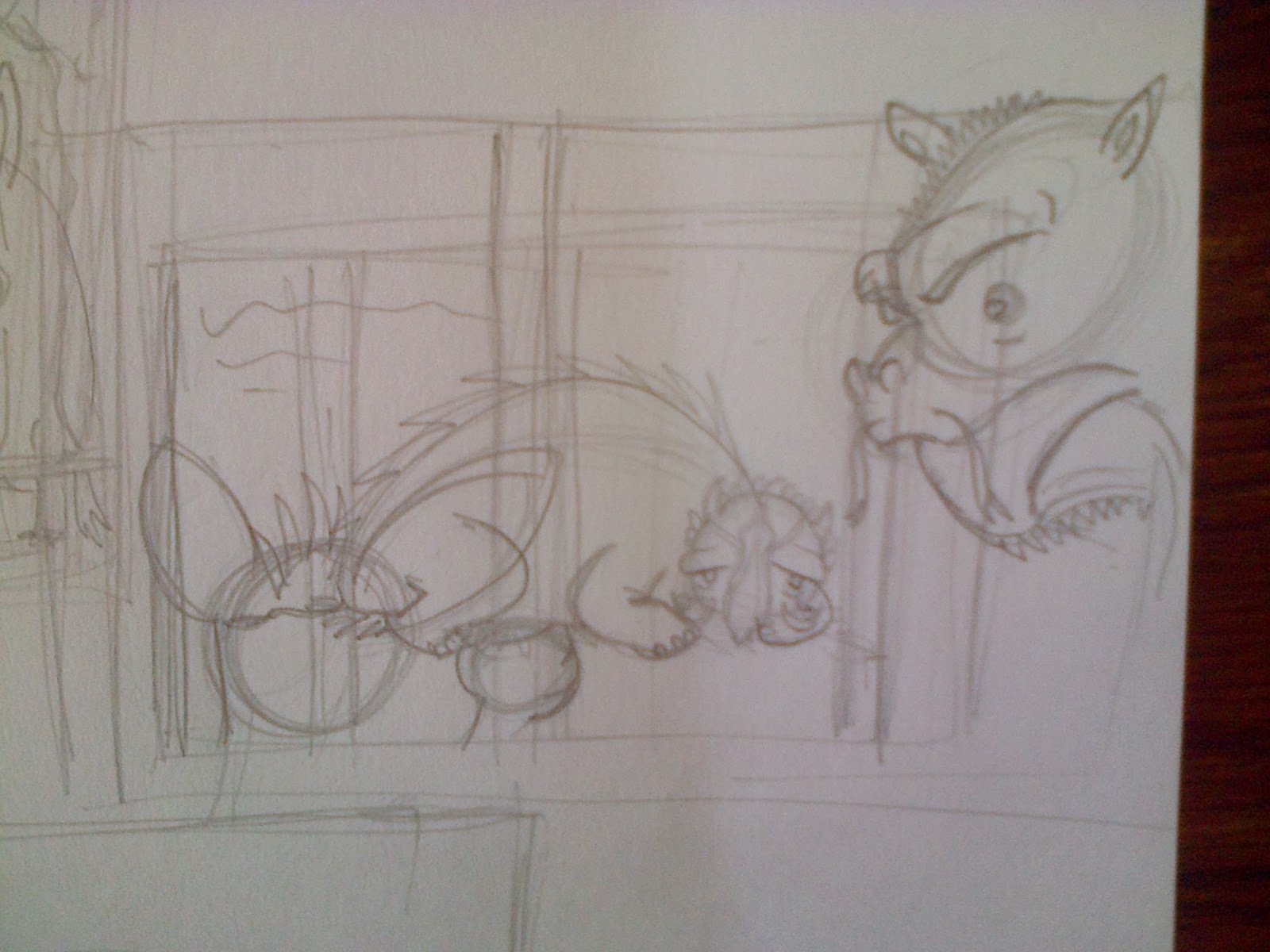
Below are a series of sketches that I did to loosen up in preparation of redesigning the characters and style of my book. It's mostly a mish mash of hybrid animals, weird shapes and cute, patterned creatures.
The Takers themselves though, are monsters, and should be reflected as such. They need to be fantastical and insane and wonderful to look at, since they're the ones getting all of the coverage in the book. I've got quite a lot of time to play around with character design anyway so there will probably be a few pages like this in the coming weeks.
I also think that I'll be working with scanned pencil images and using very light, but bright, colours. Or perhaps barely any colours at all. I want more white in my book. I loved it in Wolf Won't Bite by Emily Gravett.
Also, some of the looser, sketchier images on this page work better, but I'm finding it really hard to work that way. I instinctively want to refine sketches and make characters three dimensional so that they can exist in a logical, though fantastical world. This really isn't necessary. I've got a tutorial tomorrow too, so if I can throw out a lot of designs in the meantime then maybe tomorrow we'll have a better idea of where we're going right or wrong. These characters were drawn on an a2 piece of paper with an HB pencil.


Friday, 10 January 2014

Feedback and moving forward...

So for my PMP I got a 58, which the tutors said was really good because moving from level 5 to level 6 is a real game changer, or something. That's fine, I'm cool with that. My main criticism is that my book might be looking too traditional, or flat or the characters aren't contemporary enough etc etc. This means I've been asked to spend two weeks pushing character designs, examining contemporary books for modern character design, thinking about changing up the scene rather than blending into it. I'm sort of relieved. It means I can start over. The story is the same, but there's no need to ground this in logic - my biggest burden. I can have it absolutely mental, and fuck, I SHOULD have it absolutely mental. Like, why the hell aren't the takers all designed to reflect their specific method of taking? This excites me. It can open up to a world of fantasy things that are just insane. The takers don't need to be identifiable by their species, the fact that they take is enough. So, pictoplasma. That stuff is great. I love it. Also the spirits from the Avatar world (not the blue avatar world, the AWESOME avatar world, as in the last airbender and the legend of Korra). There have been two episodes from the latest series of The Legend of Korra that blew my mind. Everything was perfect and gorgeous. Strange spirits and animal hybrids and all sorts. Oh yeah, on that subject, Lisa was quite into the idea of animal hybrids like some of the ones I did early on (a bear crossed with a deer and a cow). But I'm walking into dangerous territory here. I've gotta be careful not to emulate things that I love. So all that aside, I guess we're on to a new beginning here. I don't even need to finish my book (that's what Lisa said, and now it's written down, as evidence and shit). Also, Joel said that it should either be super stylised or grounded, not so much both. I think he said that anyway. It's hard to remember everything. I'm excited, but also exhausted. Too much socialising today. So for now I'm going to share with you some pictures of the spirits from The Legend of Korra and take a nap. Oh also, I suppose some of the later Pokemon were pretty incredible in their character design too. I think when I start I'll begin by looking at animals and seeing what weird variations I can create. Maybe.


Thursday, 9 January 2014

NO NO NO silly girl...

Okay I'm pretty happy with this for now. I can at least start the next page in the story now, which will be following on from this example.


I've decided to cut the following lines "But the girl wasn't fooled" etc etc, because they aren't really essential and were screwing with the composition of this page, which now is all spoken text.
Think I'll remove that bird actually. Maybe. Yeah probably.

Monday, 6 January 2014

LOOKOUTAGAZZILLIONVERSIONSWITHTINYLITTLEDIFFERENCESINEACHONE!!!...


Ok so, things to note. I changed "he replied" or "she replied" to "silly girl" so that the entire thing is basically speech. That works better right? Good, I thought so. Now I still don't think this works gorgeously as a double spread, but when it's split up by the page border I think it will look like two very nice individual pages. Ummm what else? I mentioned before how these pages will get more interesting as time goes on because there will be more takers on each left hand page. I also want the girl to react to the text in some instances, you know, as if it's literally there, falling down upon her. Maybe. We'll see. I think we're getting close to sorting this page out though. Oh and I like the 2nd image from the top best. I like the font. I think the text works better without it following the sketchy roots of the cartoons. Not sure if I'm allowed to even use that font though.

Sunday, 5 January 2014

Design plans...

So right at the start I sort of decided on having full double page spread illustrations for this book. This can make things a little complicated if there is a lot of information to convey but so far it's been working fine. However, I may go back to some of my earlier ones and make some pages spot illustrations rather than full bleed ones. Also, I've been working on this image below. I've already done that page but as discussed (at great and annoying length) with a friend, the NO NO NO page is like the hook for the kiddies and therefore it needs to stand out. So, in order to do that, it's gonna be just the characters in the conversation and hand written text. Also, as the story progress, the other takers will be in each new encounter. So by the final NO NO NO it will have all of the takers on the left hand page and the girl on the right. When I do that I want to have some of the takers start to look concerned at each new thing being questioned too. So for example, the first taker is confronted about using animals for food, but by the time he gets to, say, the taker who uses animals for their skins, I want him to show concern, like he's debating the ethics of such a practice. After all, just because the individuals agree with one thing doesn't mean they will agree with them all. This will make the pages a little more interesting and also create a good transition to the takers finally agreeing with the girl. BOOM.


Now, in regards to this picture, it's really REALLY difficult to position the images and the text, I've been doing it for hours now. Also, the way I do the hand-drawn text won't necessarily be anything like that, this is just a layout rough to see what's possible. Bloody tricky stuff though. I think I can make the image work better if I position the text in an aesthetically pleasing way first and then work my characters around that. It's gonna get crowded when there are more takers on the page too so I might want to shrink the characters down too. Here's a little progress since the above image. Didn't think it needed it's own post.


Thursday, 2 January 2014

New version of that crappy page that I did...

This is much better. I figure we don't need to see the little girl or the taker she's talking to on every page. The next double page will be the "NO NO NO" etc thing, so we can get a picture of the new taker on that page anyway. But this is much less cluttered, much brighter and just more interesting to look at. Glad I didn't settle for the shitty one.


Wednesday, 1 January 2014

Text, sketches and a new page...

So I've placed text on my images now. Some are working better than others, which I kind of expected. For instance, the first encounter with a taker has a huge bulky page of text. I'm thinking of either chopping that text so that there's some at the top of the page and some at the bottom, or I'm thinking I can lose a couple of lines from my taker encounters. As for the latest page, I think I might redo it. I wanted it to be close up to contrast against the previous page but I dunno, it's not visually very interesting, the colours are washed out due to lack of environmental features and it also made placing text pretty difficult. I'll have a rethink. As you can see, I had several thumbnail ideas for that page anyway so I might try one of the others.